Color is the first thing people notice about an outfit, and it is often the last thing they think about when getting dressed. The result is predictable: a closet full of good pieces that rarely work together, and a daily routine built on guesswork. The good news is that color coordination is not a matter of innate taste. It is a system, and like any system, it can be learned, practiced, and refined. This guide breaks down the principles professionals use so you can build outfits that look intentional every time.
Start With the Color Wheel, Not Your Closet
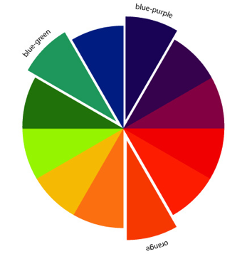
Every solid color strategy begins with the color wheel, a simple visual map that arranges hues by their relationships to one another. Understanding three core relationships gives you the foundation for nearly every combination you will ever need.
- Complementary: Colors opposite each other on the wheel, such as blue and orange or red and green. High contrast, high impact.
- Analogous: Colors adjacent to each other, such as navy, teal, and forest green. Harmonious and easy to wear.
- Triadic: Three colors evenly spaced around the wheel, such as red, yellow, and blue. Bold and visually balanced.
You do not need to memorize the wheel. You need to recognize these relationships when you see them, because that recognition is what separates a deliberate outfit from a random one.
Build Around a Foundation of Neutrals
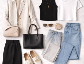
Neutrals are the backbone of a wearable wardrobe. Black, white, gray, navy, beige, and brown anchor an outfit and give bolder colors somewhere to land. A common mistake is treating neutrals as boring; in practice, they are what makes color look expensive rather than chaotic. A single vivid piece against a neutral base reads as a choice. Three vivid pieces together read as an accident.
Establish your neutral base first, then introduce color as an accent. This single habit will improve your outfit success rate more than any other.
Apply the 60-30-10 Rule
Interior designers have used the 60-30-10 principle for decades, and it translates directly to personal style. The idea is to distribute color by visual weight rather than splitting it evenly.
| 60% | Dominant base color | Navy trousers and a navy jacket |
| 30% | Secondary support color | A light gray shirt |
| 10% | Accent color | A burgundy belt or pocket square |
The rule is a guideline, not a law. What matters is the principle behind it: dominant, supporting, and accent roles create hierarchy, and hierarchy is what the eye reads as polished.
Match Undertones Before You Match Colors
Two shirts can both be “blue” and still clash, because what separates them is undertone. Every color leans either warm (yellow, red, or golden base) or cool (blue or green base). Pairing garments with mismatched undertones is one of the most common reasons an outfit feels slightly off without an obvious cause.
This is also why certain colors flatter some people more than others. Matching a garment’s undertone to your own is not a rule of fashion; it is a matter of contrast working in your favor.
Use Value to Create Depth
Value refers to how light or dark a color is, and it is the most underrated tool in color coordination. An outfit made of colors at identical values can look flat even when the hues are correct. Introducing variation in lightness creates depth and dimension.
Try a dark outer layer, a mid-tone shirt, and a lighter trouser. The eye moves naturally through the contrast, and the outfit gains structure without adding a single new color.
Know Where to Break the Rules
Every guideline here has a legitimate exception. Monochrome dressing, for instance, deliberately ignores the 60-30-10 rule and works precisely because it commits fully to a single hue at varying values. Statement pairs like red and pink violate traditional color theory and succeed when the wearer commits with confidence.
The point is not to follow rules blindly. It is to understand them well enough to break them deliberately. A rule broken by accident looks like a mistake. A rule broken on purpose looks like style.
Practical Next Steps
- Audit your wardrobe by neutral base, then by accent.
- Photograph three outfits you already like and identify the color relationships at work.
- Choose one accent color per season and build around it.
- Test combinations in natural daylight before committing.
Color coordination is a skill built through repetition and observation, not a talent you either have or lack. Start with a neutral foundation, apply the 60-30-10 distribution, respect undertones, vary your values, and break the rules only when you know why. Do that consistently, and getting dressed stops being a gamble and becomes a reliable process.