Color is the most immediate signal in any outfit. Before a single word is spoken, the interplay of hues on a man’s frame communicates intent, taste, and attention to detail. Yet for many men, color remains the most intimidating variable in the styling equation. The good news is that color coordination is not an art reserved for the naturally gifted—it is a system. Like any system, it can be learned, tested, and mastered. This guide breaks down the mechanics of color combination so you can build outfits with confidence and consistency.
The Foundation: Understanding Color Theory
Every color decision rests on the color wheel, a visual representation of the relationships between hues. Mastering three core relationships will cover the vast majority of real-world styling scenarios.
Complementary Colors
Complementary colors sit directly opposite each other on the wheel—navy and orange, burgundy and olive, blue and mustard. These pairings generate maximum contrast and visual energy. The key is proportion: let one color dominate and use its complement as an accent. A navy suit with a burnt-orange tie reads as sophisticated; equal halves of each color read as a costume.
Analogous Colors
Analogous colors are neighbors on the wheel—blue, blue-green, and green, for example. These combinations feel harmonious and low-risk because the hues share underlying pigments. They are ideal for building tonal outfits that look intentional without shouting. A teal shirt under a navy blazer with charcoal trousers is a textbook analogous composition.
Monochromatic Palettes
Monochromatic dressing uses a single hue in varying shades, tints, and tones. It is the most reliable path to a polished look because it eliminates the risk of clashing. A light grey shirt, mid-grey trousers, and a charcoal overcoat demonstrate how depth can replace variety.
The Neutral Anchors
Neutrals are the load-bearing walls of a man’s wardrobe. They do not compete; they provide structure. Treat the following as your permanent inventory:
- Navy — the most versatile dark neutral; softer than black and flattering on nearly every skin tone.
- Grey — from light stone to charcoal, grey bridges warm and cool palettes effortlessly.
- White and Off-White — the universal brightener; a white shirt resolves almost any color conflict.
- Beige and Khaki — warm neutrals that ground bold colors and soften dark tones.
- Black — high contrast and formal; best used deliberately rather than as a default.
A practical rule: build every outfit from two neutrals, then introduce one or two accent colors. This 2+1 or 2+2 formula keeps outfits controlled and repeatable.
The Sixty-Thirty-Ten Rule
Borrowed from interior design, this proportional framework translates directly to menswear. Allocate roughly sixty percent of your visible outfit to a dominant color (typically a neutral such as navy or grey), thirty percent to a secondary color (a shirt, trouser, or knit), and ten percent to an accent (tie, pocket square, socks, or watch strap). The ratio prevents any single hue from overwhelming the eye and gives accents room to register.
Matching by Undertone
Colors interact with skin tone, and ignoring undertone is the most common reason a technically correct combination looks off on a specific wearer.
| Cool | Pink or blue undertones; veins appear blue | Navy, charcoal, true blue, emerald, burgundy | Mustard, orange, warm browns |
| Warm | Golden or olive undertones; veins appear green | Olive, camel, rust, forest green, cream | Icy pastels, stark grey, magenta |
| Neutral | Balance of warm and cool; veins appear mixed | Most palettes; rely on contrast level | Extremely saturated neons |
Test colors near your face in natural daylight. If a shade makes your skin look tired or washed out, it belongs on your lower half at most—never at the collar.
Contrast: The Hidden Variable
Value contrast—the difference in lightness and darkness between garments—matters as much as hue. High-contrast combinations (a crisp white shirt with a charcoal suit) project sharpness and formality. Low-contrast combinations (a light blue shirt with mid-grey trousers) project calm and approachability. Match contrast to context: job interviews and evening events reward high contrast; creative environments and weekends reward low contrast.
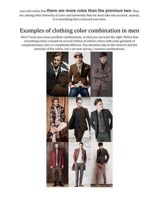
Practical Combinations That Work
Common Mistakes to Avoid
- Too many accents. If the tie, pocket square, and socks all compete, none of them wins. Limit loud color to one zone.
- Ignoring pattern scale. Color coordination fails when a check, a stripe, and a print all demand attention. Keep patterns tonal and vary their scale.
- Forgetting the shoes. Footwear should either echo the trouser tone or anchor the outfit with a deliberate neutral—brown with warm palettes, black with cool or formal ones.
- Matching too precisely. Exact color matches look dated. Aim for harmony between tones, not duplication.
Conclusion
Combining colors in men’s fashion is a discipline of constraints, not inspiration. Anchor with neutrals, apply the sixty-thirty-ten ratio, account for undertone and contrast, and restrict yourself to one accent per outfit. Follow these rules consistently and color stops being a risk—it becomes your most precise tool for self-presentation.